 I have been playing around with song lyrics from Keane's Frog Prince; trying out Holbein Acryla Gouache for the first time. It is hard to stop! There are Infinite possibilities!
Monday, October 30, 2006
Holbein Acryla Gouache
I have been playing around with song lyrics from Keane's Frog Prince; trying out Holbein Acryla Gouache for the first time. It is hard to stop! There are Infinite possibilities!
Friday, October 27, 2006
Sacred Cows
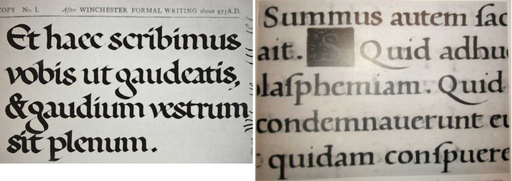
On the left is Edward Johnston's Foundational (image taken from Formal Penmanship ed. by Heather Child); on the right is a humanist bookhand written by Arrighi himself, in 1520 in Rome (image taken from Stan Knight's Historical Scripts).
Is there anything more sacred among calligraphers (especially you Brits) than the name Edward Johnston? One always watches one's step when speaking of the revered Johnston. His great work, Writing and Illuminating and Lettering was published in 1906 and is referred to as 'the calligrapher's bible.' However, I am not the nice girl my mother so desired me to be and I just have to bring this up.
Foundational vs. Humanist Bookhand. The first, Foundational, is the hand 'rediscovered' by Edward Johnston in the later 1800s, polished up, and trotted out for the first modern generation of calligraphers to learn. Edward Johnston based Foundational on his study of a 10th c. English manuscript, the Ramsey Psalter. He taught his first class at the Central School in London in 1899, and the rebirth of calligraphy was on its way.
Humanist Bookhand, on the other hand, is a style of lettering used extensively in the 15th century in books. It was an influential style of writing. It is, in fact, the basis for the first typefaces ever designed.
Now, all of this is fine. I do not have a bone to pick with Edward Johnston. I respect his efforts greatly. The bone I have to pick is with those who came later, who picked up the Foundational flag and ran with it, to the exclusion of Humanist Bookhand. It seems to be left to me to remind people that Humanist Bookhand exists! It is not all just Foundational! I believe that when calligraphy book authors include Foundational in their books, they should also include Humanist Bookhand. Foundational is kind of like Neuland, in that both are alphabets designed by individual men (even though Johnston got it from a historical manuscript, he still adapted it somewhat and 'made it his own').
And 10th c. vs 15th? A difference of 500 years! How can anyone (and they do, in practice) lump Foundational in with Humanist Bookhand? It is a wierd process by which Foundational was propogated for a long period of time in the 20th c. and now somehow the general understanding among calligraphers is that Humanist Bookhand and Foundational are one and the same. So frequently people say 'Foundational' when they mean 'Humanist Bookhand.'
Honestly, I adore Charles Pearce. But in his book The Anatomy of Letters he has a Foundational exemplar which has distinct Humanist Bookhand characteristics. He has altered the bowl of the miniscule 'a' so it is nice and curved. And he has also 'fixed' the miniscule 'g' so its lower counter doesn't make me cringe; it is more balanced. Yet he has retained the built-up serif in the ascenders. I do actually like his hand here much better than Johnston's Foundational. I just think Maybe Mr. Pearce ought to have mentioned that he started with Foundational and made some adjustments so it is something of a hybrid.
And in the Speedball Textbook Foundational is represented but not the more general Humanist Bookhand. At least in Jacqueline Svaren's Written Letters she discusses and has an exemplar of Humanist Bookhand--and she has left out Foundational! Although she does talk about Edward Johnston.
Why should I care about all this? Maybe because my early training was in Humanist Bookhand, and it was only later I met other calligraphers who would refer to work I had done as Foundational. As I have never made a concentrated study of Foundational I really can't be said to write it! I have superficially studied it to notice its distinct characteristics. But I have been a irked by others' insistence in using the word Foundational as a blanket term to describe all hands that are not italic, but are sort of 'standard' (meaning not carolingian, uncial, gothic, etc.).
I think I finally understand why Marsha Brady made such a point of telling us to look at original manuscripts when we want to learn a new hand. I used to think that an odd thing to say, given how many great contemporary instruction books are published now. Personally I lack the funds (time/connections/language ability) to travel to various European countries in pursuit of knowledge. I have to content myself with Stan Knight's Historical Scripts and xeroxed exemplars from classes.
Of course we owe Edward Johnston a tremendous debt for all his work. However, when Foundational is altered, as in simplified and lightened, I think it should no longer be called Foundational. It has then become something else, something more basic and universal. The calligrapher at that point has, perhaps unwittingly, returned to Humanist Bookhand. And this is just evolution, and that's ok, but let's not always call it all Foundational, for crying out loud!
The other day I picked up a little beginner's calligraphy book/kit designed as a novelty for gift shops. Sure enough, there was something inside called 'Foundation.' Now it's Foundation?! Does anyone see what I mean? It's getting more and more twisted, and who can tell where it's going to end up.
Perhaps some of the British calligraphers are puzzled and a bit insulted when American calligraphy teachers teach Humanist Bookhand instead of Foundational. I wonder if there are any British calligraphy teachers who teach Humanist Bookhand instead of Foundational? (I know there are American teachers who only teach Foundational.) I have not yet noticed any calligraphy teachers who teach both, as separate classes. They seem instead to make a decision as to which way they will go. They seem to be saying, "really, who needs both?" If you have one do you need the other? And if you go with one should you pretend like the other never existed or was irrelevant? Maybe it is editors who say, "hey, these are so similar let's ax one."
I like to think that had Edward Johnston traveled around Europe more (maybe he did and I don't know it) and studied other manuscripts from other places and times more extensively; had he gotten some distance from the Ramsey Psalter and gained a stronger overview of historical writing he would have produced a rather different Foundational. But he did the best he could, and despite my whinings I really am grateful.
PS--my maternal grandmother was a Johnston, and I like to think Edward and I are distantly related. Actually, my maternal grandmother's uncle's name was Edward Johnston! Go figure)
Wednesday, October 25, 2006
The Accidental Calligrapher
I came to calligraphy by accident, sort of. It was offered as one of three electives (illustration, typography, calligraphy) at UGA in the graphic design department. Since I wasn't an illustrator, I took it. I was full of trepidation and Ken Williams, the instructor, did not make it better. He was quite stern, despite his hippy appearance. And I was intimidated by the fabulous work he did.
We were to fill up 12 legal size sheets of paper a day with italic writing, using a 1 1/2mm Brause nib, and black ink. It took at least four excruciating hours every day to do this, and I hated it. At the end of the quarter we could choose another hand to study and had to produce a final project in that hand. I think I chose 'Legend'. Our textbook was Jacqueline Svaren's Written Letters.
When the class was done (and I got an A or a B...can't remember) I gave a final shudder and resolved never to touch another calligraphy pen. THEN--a scant few quarters later, just long enough for the memory of the pain to fade, as in childbirth--Ken Williams (that's MR. Williams to me) said for the Cortona program this year (1987) they had a guy lined up to teach calligraphy whose work was amazing, "you really ought to study with this guy." Coincidentally, John was planning on going...and I really wanted to spend more time with John and get to know him better. My gracious mother paid for the trip as a graduation present and I went to Italy and studied under Steve Skaggs, and it turned out that I liked it. (I also got to spend a lot of time with John, and we eventually got married, but that's another story.)
Steve had an amusing study plan: he would teach us four hands in (somewhat) chronological order. We started with pen-made Roman Capitals (from about 100 AD), the most challenging hand. This went over really well with the rank beginners in the group! After two weeks we moved on to Humanistica, or Roman Bookhand, from about 1450 AD. Next came Italic (Cancelleresca, from about 1500 AD) and we ended with Rotunda (Italian Gothic) from the high middle ages: 1300s-1400s. I think he saved Rotunda for last as it is so much darn fun. Our class went of plenty of field trips and looked at many original old manuscripts and stone carvings. We even went to the Vatican library, and had the whole place to ourselves because it was the Vatican's summer break.
Meanwhile I could not believe the things Steve did! He wrote in color--lots of color! And it was bright! And he changed colors in the middle of a word or even a letter! I learned you don't always have to write just in straight lines! And it doesn't always have to make sense or be legible! Wow! I was blown away watching him work on large uncut pieces of paper, in front of us, so casual about it. Wow--you can do a project without freaking out first for weeks at a time, planning it, making sure it will be just right?! Without tons of tracing paper overlays? Endless tests on smaller pieces of paper to get the color right? What about perfection? What if it's not perfect? Aren't you worried? Steve was never worried. What a gift that man has for fearlessness.
(I also learned that until you can make letters and words without thinking about them there is not much point in trying the wild stuff. Well, for me it anyway.)
He said you just have to establish what the rules are in any given piece, and stick to them. I still have trouble with that: in any given piece I forget to establish any rules, or I change them as I go. It's always a grand free-for-all, and then I'm surprised that it didn't work out like I thought it might.
Monday, October 23, 2006
Every soul is a melody
 Part of a large sheet of Indian River rough watercolor paper that was covered with marks, lettering, paint, etc. Just for fun.
Wage Peace
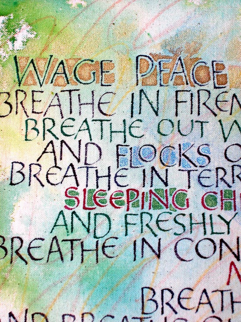 Mary Oliver is the author of this poem, which was circulated via Internet after 9/11. I keep writing it, over and over, feeling like if I write it enough times I'll get it just the right way, and than there really will be peace. It's such a long poem it's impossible to represent it here in such a way that you can really read the whole thing.
(I did this on canvas with airbrush pigments and fabric dyes and gold ink and it looks like colored pencils. But it is gaudier than I wanted it to be--too much pearlescent ink I guess. I've been striving for 'serious, but fun' which is evidendly near impossible for me.)
John Neal, Bookseller
John Neal, Bookseller is still my favorite place to buy calligraphy stuff. Sometimes I try other places, but I end up feeling like I've been disloyal. So back to John Neal I go. I love his website, I love the people on the phone when I call. They are always calm and helpful and send me my things as soon as they can. PLUS, he is in Greensboro, North Carolina, where I first went to college. I was at UNC-Greensboro; I am still not sure why (I thought you are supposed to go away for college--after two years I went back home, and to UGA). But on Friday nights in my freshman year (1981-1982) I used to walk up Spring Garden Street to a corner bar where you could get three Little Kings for a dollar--the drinking age for beer and wine was still 18 then--and there was loud music and dancing, and I thought it was alright. Much later in the evening my friends and I would stagger back to our dorm, passing John Neal, Bookseller, and I always thought, "hey that looks like an interesting place." but he was very sensibly closed at that time of the night, so I never stopped in. Perhaps this was even before he began hawking calligraphy supplies. We also used to stop at the Dominos pizza place and get a pizza, sitting on the sidewalk to eat it. Every time I order from John Neal my little freshman year adventures flash through my mind. And that is as close as I got to calligraphy at that time of my life.
Wednesday, October 18, 2006
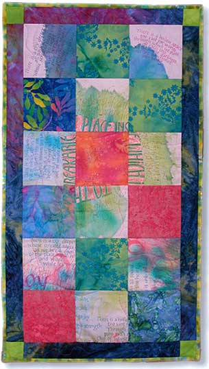 This is about 12" x 22". It is the result of a failed work on fabric. I cut up that work into blocks and alternated those with some batik fabric. This was one of the pieces I did when I participated in a arts and crafts sale a couple of years ago.
The thing is, you put soooo much time into a thing like this--and then you're going to sell it for $50-$75? This is why I only did the sale that one time! Maybe I'm just a slow quilter--and I do machine quilt--but it took just about forever to make this little thing.
Even though I have loved making quilts, I'm taking a haitus from that. Too much else to do calligraphically!
Monday, October 16, 2006
Cyberscribes
Cyberscribes is a fantastic resouce--calligraphers from all over the world contributing their knowledge and opinions on a listserv. I love the diversity of it all. I would be terribly bored if it was simply a sterile compendium of information, with a liberal peppering of cutsiness and rah-rah comments. So I don't mind when some pipe up with irreverent comments; comments that cause others to send scathing posts the gist of which is usually, "be nice" and "we don't need any of your kind here."
My train of thought led to Shakespeare, and how all the world's a stage. Never more true than on a listserv! And that led to thoughts of England, and the monarchy, and I came up with this: If Cyberscribes could be thought of as a royal court, then I proclaim Sheila Waters the queen (because of my great respect for her, plus she has proved herself over time besides which she never loses her composure) and Rafael court jester. I would not say this if I did not highly value the position of court jester. The jester can get away with pointing out things that others would be flayed for. It is a sort of social system of checks and balances. Someone needs to constantly make others question themselves.
The fabulous Teri Martin is the owner of Cyberscribes, and therefore ranks position as some sort of high lady (duchess?). There are many noblemen and -women too, and also commoners (I humbly claim position of commoner). But enough of that. Some will begin to think I am a creative anachronist!
Wednesday, October 11, 2006
colored pencils

 Nancy Culmone came once to our guild and taught a workshop about calligraphy using colored pencils. That may have been the funnest workshop ever.
Gulliver was the name of my cat, a big sloppy affectionate lazy guy. And the 'you are a butterfly and my eyes are needles' is from a great song (Pulling Touch) by Poi Dog Pondering. It sounds like a cruel thing to sing to somebody, but the song sounds like a love song to me.
Tuesday, October 10, 2006
This pretty planet
 When my younger son was at Montessori he used to sing this song all the time--it is now my favorite song. I would make a card out of the lyrics (by Tom Chapin) but for worry of copyright infringement!
I did make an ATC out of it for an exchance through Cyberscribes.
Monday, October 09, 2006
Harvest Festival

Last Friday I went to the Lyndon House Arts Center in Athens, GA to demonstrate calligraphy for the Harvest Festival. I chose to do pointed pen, or copperplate. This is not my first love, calligraphically speaking, but it's growing on me. I had some new ink to try out and almost started jumping up and down and yelling at happy results...McCaffery's white on black Strathmore paper was stunning. And flowed so smoothly.
I was situated in a gallery with an exhibit of fabulous contemporary Mexican prints. It was a great place to be, although I was all alone! That's ok--lots of kids visited me, many of them friends from Montessori, for last year I was a substitute there. Sometimes I let the kids try it, when there weren't too many all at once. I would correct their hold on the pen and then stand back and try not mind the awful scratching sounds. None of my nibs were ruined, and only a little ink was spilled.
The folks at the Lyndon House were very good to all us demonstrators. There was food in the morning, and drinks, and someone coming around with cold bottles of water midway, and then they took my lunch order and brought me lunch. It was amazing.
Unfortunately the Lyndon House is government funded, and they are in danger of losing funding for this event, as the turnout was lower than in previous years. Why was it lower? Because the public school system in that county can't afford to send kids on field trips. Only two schools sent kids. All the other kids came in from surrounding counties or were home schoolers. (In the four years my son was in that system he only went on one field trip, and it was to the Harvest Festival. He had a great time, and I had high hopes that he would get to go the next year, but no.)
Sunday, October 08, 2006
Muscle and sweat and blood and bone
 Detail from a work on canvas, done with pearlescent ink and Rotring airbrush pigments. Some day I will get beyond the need to write in spirals. I sold this to a friend at a craft sale almost two years ago--what an eye she had for my favorite piece! However, I am only showing a detail here because I am not happy with the overall layout. The words are lyrics from the Poi Dog Pondering song Fact of Life.
You're the most beautiful world in the world
 A card design from when I participated in a craft show a couple of years ago. It is a wonderfully silly song which I love.
Humanist Bookhand
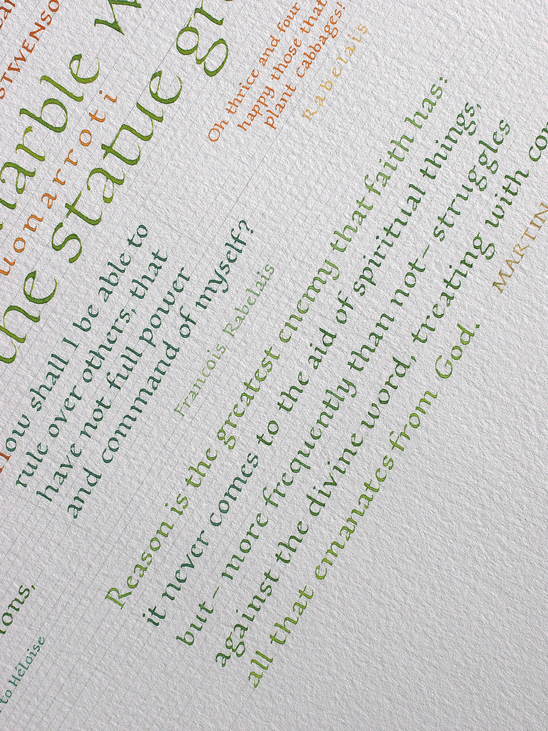 The last class I taught at the Georgia Center at UGA was a Humanist Bookhand class. To inspire the students (I hope!) I did a sampler of quotations, gleaned from Bartlett's. I worked on a a coldpress watercolor paper, which I covered with lines before I began. Then I got busy putting down lettering, with no master plan. Because all the quotes were sort of classical I made sure not to let any overlap for once. And of the three or four colors used I mixed them together some, so overall the quotes related to eachother colorwise. Mostly. Sort of.
I am still confused about what to call this style of lettering. Some calligraphers--the ones from England mostly--would call this Foundational, which was the hand rediscovered by the famous Edward Johnson, based on his study of the Ramsey Psalter (10th century). However, I've always thought his Foundational hand is more distinctive than my lettering here. His featured an odd g, and on ascenders an unappealing built-up serif. I much prefer no manipulation at all when I write in a humanist bookhand.
My humanist is a distillation of many humanist bookhands--hands (not fonts!) that were used to write books with during a period of time, primarily the 15th century, in Italy. I learned from Steve Skaggs in Italy in the summer of 1987 and from Marsha Brady over three weekend-long classes in the mid-90's. Steve called it Humanistica, or Roman Bookhand.
I cannot bring myself to call mine Foundational, nor can I bring myself to generically refer to all such similar hands as Foundational. Maybe I should just admit that I am not fond of Edward Johnson's Foundational, although he is credited with being the father of modern calligraphy, and I'm glad someone brought it back from the brink of the abyss of forgotten knowledge--if that is indeed where it was.
Thursday, October 05, 2006
Gather ye rosebuds
 A work in progress. At one time I had something perfect planned to add...I have since forgotten what it was...but eventually I will add some more writing. Originally I wrote out the 'Gather ye rosebuds' text, and then was bored with it, so I sort of washed it off--why is it so much fun to put lettering under the bathtub faucet? It is quite possibly my favorite thing to do with calligraphy! Later I wrote the other text on top...I have got to get better about adding the author credits, I know... The black scribble is actually some words too, but I can't remember what they say. This piece is a few years old.
Way back in 1998 or so Steve Skaggs and Eliza Schulte Holliday came to our guild in Atlanta and taught an experimental workshop, with the intriguing title of Jazzwriting. I was captivated, enthralled, delighted. It was a magical weekend away from my regular full-time duties as mother-of-a-two-year-old. Steve was planning to write a book about the process--whatever happened to that? Anyway, I love the idea of layering lettering; some remaining legible and some becoming completely illegible. This piece here is not there yet.
Wednesday, October 04, 2006
Alphabet
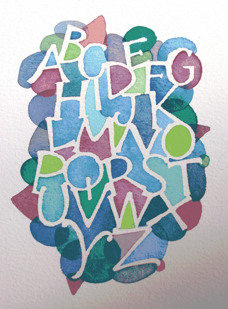 This is a resist piece I did once, for fun. After the liquid drawing gum is applied and dries completely, you can paint watercolor in between the letters. When it is dry you peel away the drawing gum to reveal the white beneath.
Carrie Imai
The above is a table tent by Carrie Imai. She made one for everyone!
Two weekends ago I took a one day workshop in Atlanta with Carrie Imai, who came from California to teach us. It was a great workshop: the subject was Neuland, which is the name of a typeface designed by Rudolf Koch in the 1920's. Carrie was teaching Neuland variations, lettering done by hand with large (1/2") Automatic pens. I was grateful to her for her extensive preparation. She gave each of us our own 50-page book which she had assembled, full of exemplars and samples. She had dozens of pieces of art pinned all around the room to inspire us. She was most affirming and positive and the room buzzed with our activity and attention.
Keep a green tree in your heart

This is a Chinese proberb with which I have been obsessed. I have written this out more times than I can count, and in many different ways. Would it be too hokey to get my husband to draw a little illustration of a bird in the middle?
Unfortunately I chose Dr. Martin's dyes with which to write, and they are highly fugitive. This will likely disappear altogether in twenty years! Hey, it's all part of the excitement.
I tore the edge of this in a circular shape, and even found the perfect round frame to put it into, but it is not even on my list of priorities to cut a mat and order a round piece of glass and put the whole thing together! Someday...
Tuesday, October 03, 2006
All you...


Lettering on fabric. The green letters were done with a 1/2" flat brush and Sennelier Silkcolor fabric dyes; the brownish letters were done with a steel nib and FW acrylic ink. I also applied fabric dyes to the background. I may yet do some sewing to render this into a finished piece. Currently it is just a loose piece of muslin.
Why do we do it?
I am not sure why I persist in doing calligraphy. I go through periods of mild depression and boredom over it, but I always return. Many think it is a ridiculous thing to spend one's time on, even if it is continuing an ancient tradition.
I like to think of the medieval monks in their cloisters, arduously copying out holy texts for 'the glory of God.' They froze in winter and roasted in summer. They put up with aching backs and cramped fingers. They worked on animal skins which had been processed so the surface was suitable for writing; there were many technical difficulties. When they made mistakes they could not start over, for vellum and parchment were precious. Mistakes, when caught, were corrected in often amusing ways. Without the monks much knowledge would have been lost--we owe them a great debt. (If I had three wishes one of them would be to go back in time and visit the scribal monks.) The only way I know how to repay the debt is by continuing the practice of the art, and doing my part to introduce others to this ancient craft. (See, it is an art and a craft--depending on your point of view and your place on the journey!)
I have never yet been brave enough to work on vellum. Instead, I work on paper, preferably fine cotton rag paper. The kind made for watercolor (such as Arches) or for charcoal/pastel drawings (such as Ingres). I do not like to stay in the lines. Yet I always default to that when designing a new piece...and slowly work toward getting out of the box. I love to do crazy pieces, things that are hard to read. I also like to write on fabric--100% cotton for quilting, or 100% cotton canvas.
All I know is, when the world starts crowding in I can go down to my little haven of a workspace and be in my own world, surrounded by favorite texts and tools and light. I like to spread texts that contain hope, and joy, and sometimes irony or acceptance of our fate. Occasionally I suspect what I do is a bit 'precious,' whatever that means, and I have to sigh and resolve to walk on the wild side more. I try not to take myself too seriously, although I can't help but fall in love with my own work sometimes. It is like one's children: you love them dearly despite their faults and shortcomings. There are always problems, and I have learned to take satisfaction in the problems as evidence of the distance yet to go.
Subscribe to:
Posts (Atom)