This has been a really busy week for me, and it's not over yet! Tomorrow is the Bridal Show at the Gainesville Civic Center, at which I will have my own booth. I've been busy preparing for that: making more samples of envelopes and invitations, including an album. I found the album in Helen last weekend at the cross stitch store. It is a beautiful thing, covered with handmade paper full of pressed flowers and leaves. I will leave the clear protective cover on it, otherwise it will quickly turn brown. (People's hands are so much dirtier than they realize! And I am not a clean freak either.)
John made a sign for me to put on the table. He also printed out a bunch of information sheets for me to hand out, and took care of business cards. I am to have a real website, although the account is 'still pending changes' so I can't set it up yet. John had already spent a lot of time preparing the site pages, and loading them on his site, but I don't want prospective clients to have to key in 45 letters or so for my address, so we're changing it.
Also last week was National Handwriting day. Tuesday, January 23. I did a 50 minute lesson at my son's 5th grade class, and in the afternoon had a table at the local public library to write names on bookmarks to give to patrons. We set up the books the library had about calligraphy, and the librarian in charge of adult programming had made a great vertical poster about John Hancock and National Handwriting day. She included the bio I had provided her with, as well as the info on Atlanta Friends of the Alphabet. There was a decent turnout, including several people who came just because they are interested in calligraphy. I had a great time talking to them.
And of course, the biggie still hanging over my head is the quilted wall hanging for my aunt. It is hard to finish it for many reasons...I just want to keep experimenting! And then I end up overworking each piece until it becomes muddy, and then I think she won't like it if it is muddy... also I wonder what to do about the binding; whether it should be a traditional quilt binding, or do a wierd hand sewing job with the fake fur yarn, or maybe bind with a fat ribbon, or leave the edge raw (nope).
When I work on many things at one time I am so stimulated creatively! I am overwhelmed with possibilities!
Saturday, January 27, 2007


Friday, January 26, 2007
Friday, January 19, 2007
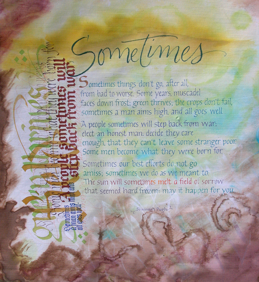
Sometimes
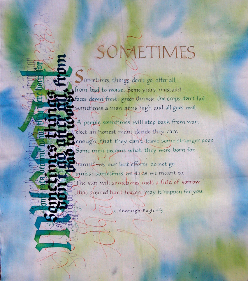
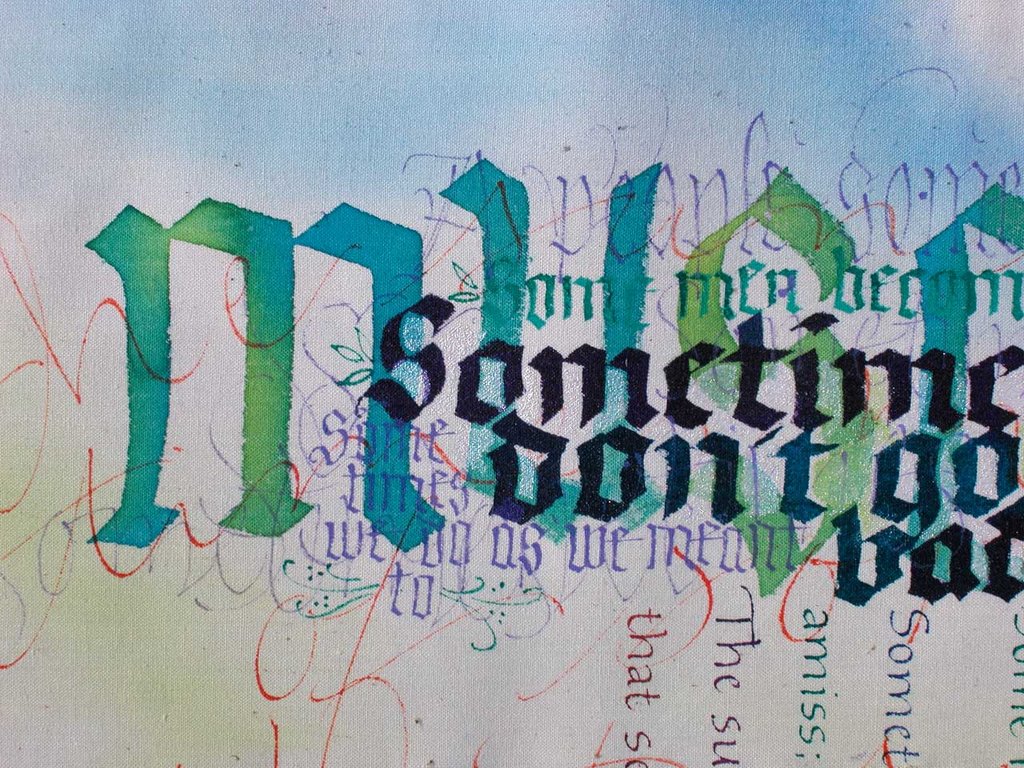
I'm working on a piece for my aunt. She commissioned me to do this a loooong time ago. I've been remiss. It is to be a quilted wall hanging. This is one I thought could be for her, but it's not right yet. Not happy with the roman caps title, among other things. I'm doing more of them, on a finer muslin, which is creating other problems having to do with the ink bleeding into the fabric when I use a lot of ink (acrylic airbrush pigment) at once. This, even on freshly bought 100% cotton muslin, unwashed so the size is still in it. But the one here is on a heavier weight cotton fabric--I think it is 'duck.' And it is great to work on! Why didn't I buy more of this this morning? Because it isn't really what I want to use for quilting. Decisions, decisions. Something lost, something gained.
Monday, January 08, 2007
Calligraphic Folly
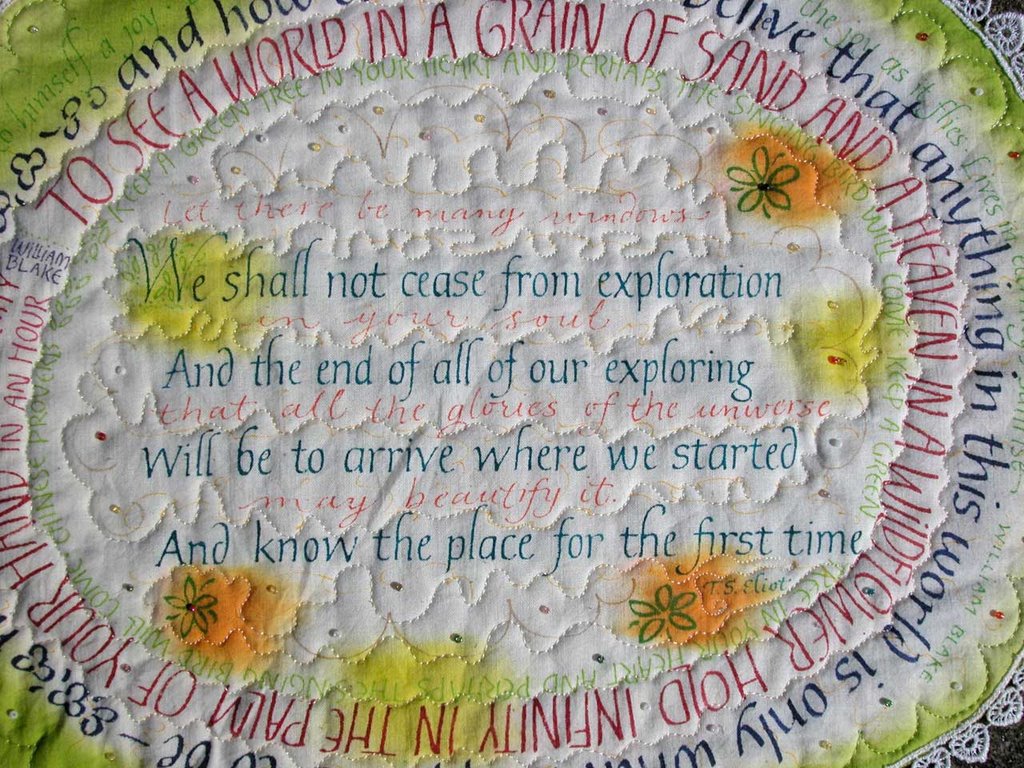
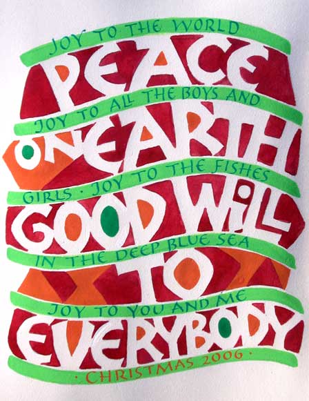
I figure the point of doing something like calligraphy is so that you can 'do whatever you want.' It doesn't have to be a poem by Shakespeare written in black ink in an appropriate hand.
In honor of the new year I have dredged up one of my favorite bits of nonsense. I think it appeals to no one except me, and even I sometimes ask myself, when I come across this in my big box of fabric things, "what were you thinking?" Most people look at this and say, "Is it a placemat?" For it is exactly the size of a placemat, just because it worked out that way. And now I'm thinking, what a good idea. Yes, it's a one-of-a-kind placemat.
I think I was thinking of my grandmother. Just because the bit of lace with which I adorned the edges is from a trunk of hers from about a million years ago. I have never yet met anyone else whose house has a 'trunk room.' It was above the old kitchen in her antebellum home and was accessed by going through a little hall and up about five stairs; then it was the room on the right. (The room on the left was the 'back bathroom.') There were marvelous things in those trunks: clothing and accessories from several generations of ancestors. Whenever we played hide-and-seek someone always ended up in the trunk room.
At any rate, I hope the new year contains some folly--in the best sense of the word--for all of us!
Sunday, December 10, 2006
Whoa! A private school (the Mary Erskine and Stewart's Melville Junior School in Scotland) is having students use fountain pens to do their work. They say good handwriting is as important as ever and helps build self-esteem. I love it! I am encouraged! There may be hope for the world yet!
excerpt from the AP article:
Ten-year-old Cailean Gall has been using fountain pens in class for two years. It took the keen soccer player one month to master the pen and, like all pupils at the school, still has regular handwriting lessons.
excerpt from the AP article:
Ten-year-old Cailean Gall has been using fountain pens in class for two years. It took the keen soccer player one month to master the pen and, like all pupils at the school, still has regular handwriting lessons.
"At the start it was hard because I kept smudging, but you get used to it," he said. "I still have to use a pencil for maths, and now I find it strange using the pencils. I like it because it makes me concentrate much more on my work."
Cailean now uses his fountain pen even for non-school work, but classmate Katie Walker, 11, prefers to use ball point and pencil when not in class.
"I use it for schoolwork and homework only," she said. "It is quite easy using a fountain pen once you're used to it. My parents say it's improved my work enormously."
The children learn a handwriting style developed by teachers at the school, which charges $12,500 a year. New teachers are also put through a course on how to write with pens — as well as refresher courses on literacy and numeracy — before they are let loose in classes.
and:
Some people in wealthy nations argue that handwriting is becoming less important because of the growing use of cell phone text messaging and typing on computers, but the school disagrees.
In August, for example, examiners at the Scottish Qualifications Agency complained they had difficulty deciphering the scrawl of many students on exam papers used to determine admission to universities.
"We talk of the paperless office and the paperless world, but this is not true," Lewis said. "You still need to have proper handwriting skills."
Saturday, December 09, 2006
Where is my sumi?
I once read an account written by a woman who went to Tibet to a Buddhist monastary for a period of time. She said that while she was there many of her personal items disappeared: hairbrush, lip balm, eyeglasses, things like that. But on the last night they were all given back to her by the monks who had removed them surreptitiously as part of her training. I suppose the lesson was that we don't really need 'things.'
I like to think there is a similar explanation for the disappearance of certain things since we moved three months ago. How two large bottles of sumi ink could have vanished I'll never know. That large brown bottle sumi is the workhorse of my inks. And some of my favorite books--the ones that were on top of everything else! And an entire box of my kids' toys. I suspect monks have been creeping about my garage--where all that stuff should be--when we're sleeping. I'm hoping they give it back soon.
In particular I really need the rest of the mat cutter to finish up a freelance job...
I like to think there is a similar explanation for the disappearance of certain things since we moved three months ago. How two large bottles of sumi ink could have vanished I'll never know. That large brown bottle sumi is the workhorse of my inks. And some of my favorite books--the ones that were on top of everything else! And an entire box of my kids' toys. I suspect monks have been creeping about my garage--where all that stuff should be--when we're sleeping. I'm hoping they give it back soon.
In particular I really need the rest of the mat cutter to finish up a freelance job...
Friday, December 08, 2006
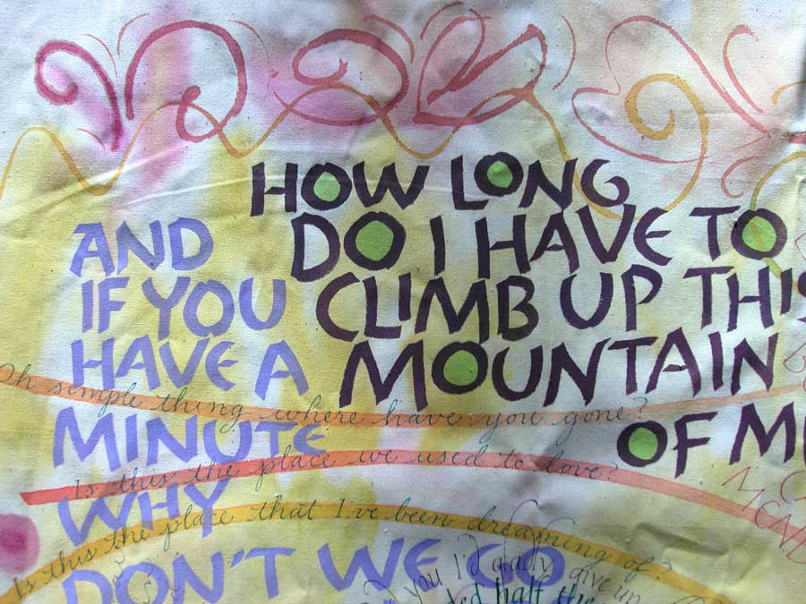
It was over a year ago that I did this piece. I was using it to see what pigments can go on top of other pigments, and learned that Rotring airbrush pigments bleed horribly when written over a thick acrylic fabric paint. These are all song lyrics from Coldplay, Keane, and the McGarrigle Sisters. All just music I was listening to at the time! I think I will redo this piece...some things were working out nicely and some weren't. What was I thinking using that lavender?! Actually, the lavender letters were the first ones I did and as I went along they became incongruent. I think I will work on this some more, in January, and then put a picture up of the whole thing, maybe even ironed.
Thursday, December 07, 2006

Sometimes I do psalms. This is part of one. I liked the way it felt as I was writing it, but then the paper ended...these things happen! Actually, this was part of a book I was making as a calligraphy journal. I got carried away and started writing before assembling the thing, and now pages are all over the place and cut up. The point of doing calligraphy in a journal was to not have to use lines. Which is why this lettering is all wavy and crooked.
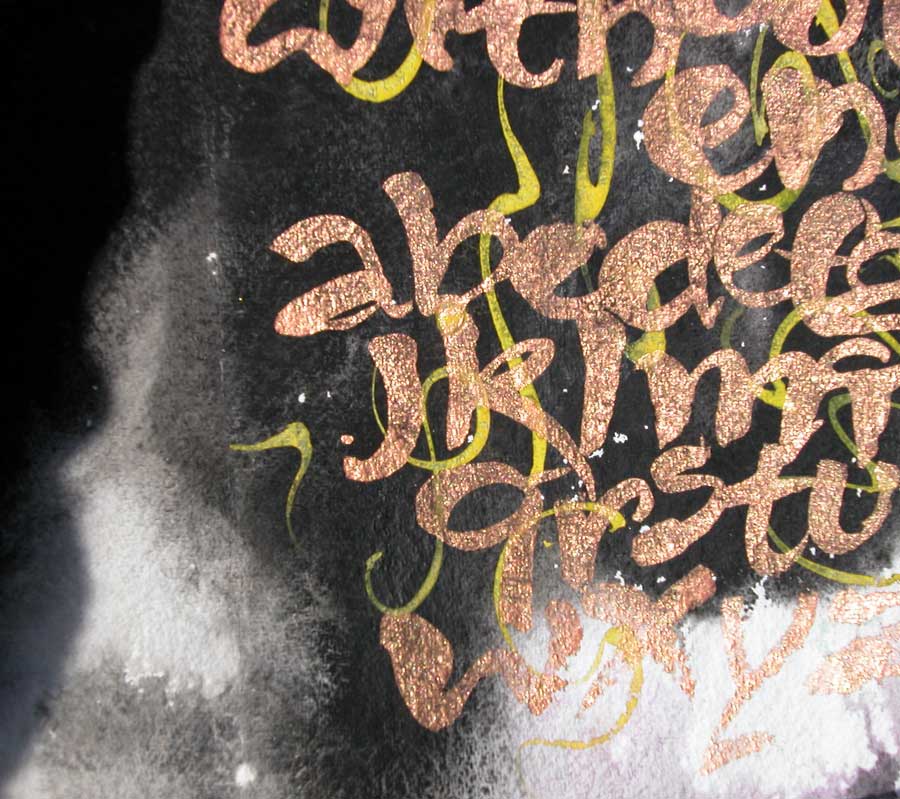
This morning I was diving in my flat files and I found this. The paper is called something like 'Indian river' paper; it is made in India, I think, and comes from Daniel Smith in Seattle. The background is black sumi ink with gouache brush lettering on top. It was a larger sheet of paper, but I cut something out so there was a hole...that is why you can just see a portion!
Wednesday, November 22, 2006
Doyal
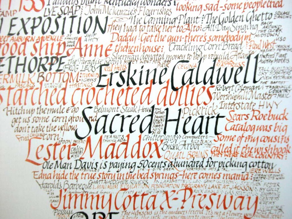
Doyal Lewis was a friend of mine when I lived in Decatur, in the late '80's to mid '90's, when he died of cancer. I could never invent a more Southern Character. He was raised somewhere in north Georgia on a farm, one of many children. As soon as he was old enough he escaped to a more urban life. He had been in the military and always appreciated it when someone sent him a card for Veterans Day honoring his service.
I knew him late in his life, when he was retired from his teaching job and had been with his partner, Charles, for over 40 years. I used to hang out at their house, for Doyal was a consumate teacher and always wanted to show me--or anyone--what he was up to. At this time of my life I was between jobs and only lived a few blocks away; I could easily walk over and stay for hours. He had had a fabulous studio built to house his elaborate silkscreen operation. He sold silkscreened cards of his calligraphy at a few shops around the city. They'd occasionally invite me to stay for supper, which was nice as my new husband's schedule at the newspaper meant he never got home before 10pm.
At Friends of the Alphabet meetings he always had a smile on his face and a twinkle in his eye. Everyone seemed pleased to see him, but not everyone liked him. He was full of jokes and witticisms, many so arcane they missed me entirely. He was also full of stories of growing up in Georgia, or the good life he lived with Charles in their grand house in Atlanta. Often the stories involved people long dead and wound all over with many asides, and it was a struggle to keep up, especially with his slow, drawling accent.
He affected to take me under his wing, I think, and advise me on the ways of the world. For I was hopelessly naive and ignorant. He brought me with him once to the the italic class he taught at Dekalb College, for he had decided to groom me to take over for him (although I didn't know this at the time). His world view involved layers of intrique and political sleight-of-hand among his friends and acquaintances. He spoke of our calligraphy guild, Atlanta Friends of the Alphabet, and the power struggle between the young and the old (which I never did see). He seemed to think the young were trying to wrest power from the old, but the old would never give it up. And now all the old of which he spoke are dead and gone. Or very nearly.
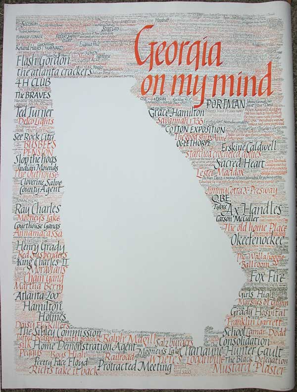
He surprised us all by having a poster printed up (25" x 33") of a bunch of quotations and words about the state of Georgia and Atlanta to sell to make a 'little money.' It was a high quality poster on heavy paper, and I still have mine. He really needed to have teamed up with an illustrator though, for the shape of Georgia itself is blank, and a huge blankness it is! But he had that kind of tenacity where he could sit for hours lettering. He said he took up calligraphy when Charles became so ill, and he had to wile away the midnight hours somehow as he stood watch and nursed him.
I eventually found a job and we bought a house a few miles away. I was busy between the fixing-up of the house and the new job, so I didn't see Doyal much anymore, and it came as a shock to hear he'd been diagnosed with cancer just months after Charles' death. Even more of a shock was his own death just two months later. He's been gone now for eleven years. I put the poster up here, with a detail, in memory of Doyal.
Tuesday, November 21, 2006
Pointed Pen
There was a lively discussion on cyberscribes (around September 24,2006) about the history of pointed pen calligraphy and its merit. Some accused Edward Johnston of denouncing the pointed pen genre of the 1800's as atrocious and thus being directly responsible for its demise in the twentieth century. You could almost hear the pointed pen supporters sharpening their vintage nibs in preparation of doing battle to protect pointed pen's reputation.
There are lots--or at least several--pointed pen styles. The two with which I am most familiar are Copperplate and Spencerian. Copperplate is actually an engraving term. Spencerian is a style in which only the capital letters are given any weight; the small letters are entirely composed of hairlines. There are other interesting terms too: Zanerian, for one. I just love that word.
When John Stevens taught a workshop in Atlanta years ago he refused to used the term 'copperplate,' feigning ignorance of the word. He would only call the style pointed pen. He used a pointed brush to letter the most beautiful lettering, which we in the class really wanted to call 'copperplate.' (I have that piece.)
On the IAMPETH website there is part of a piece by Brian Walker that has a contemporary feel to it. Look at Mike Kecseg's piece too, especially at the lettering around the seal at the bottom. (see his website too.)
But otherwise I have to agree with someone on cyberscribes who said these sort of reproduction certificates have a frozen-in-time look. It is probably politically incorrect to say this; some find this sort of blanket statement an indictment of their work. I can understand doing such a certificate once, just to see if you can, but to do nothing but the same thing over and over without exploring new avenues of growth and exploration would be the death of me.
However, nothing is black and white! I greatly admire the work of many pointed penmen and women. I have come to know many in Atlanta who excel at pointed pen work. It quite takes my breath away to see the beautiful envelopes they do. (I wish people would attempt more pointed pen artwork though.) And I wish I could do what Mike Kecseg does; he has taken this letterform to a new level.
As for websites, Paul Antonio's stands out as one I visit frequently. He is quite hard-working, dedicated and has a thorough education and understanding of what he does, something that not many of us can claim.
There are lots--or at least several--pointed pen styles. The two with which I am most familiar are Copperplate and Spencerian. Copperplate is actually an engraving term. Spencerian is a style in which only the capital letters are given any weight; the small letters are entirely composed of hairlines. There are other interesting terms too: Zanerian, for one. I just love that word.
When John Stevens taught a workshop in Atlanta years ago he refused to used the term 'copperplate,' feigning ignorance of the word. He would only call the style pointed pen. He used a pointed brush to letter the most beautiful lettering, which we in the class really wanted to call 'copperplate.' (I have that piece.)
On the IAMPETH website there is part of a piece by Brian Walker that has a contemporary feel to it. Look at Mike Kecseg's piece too, especially at the lettering around the seal at the bottom. (see his website too.)
But otherwise I have to agree with someone on cyberscribes who said these sort of reproduction certificates have a frozen-in-time look. It is probably politically incorrect to say this; some find this sort of blanket statement an indictment of their work. I can understand doing such a certificate once, just to see if you can, but to do nothing but the same thing over and over without exploring new avenues of growth and exploration would be the death of me.
However, nothing is black and white! I greatly admire the work of many pointed penmen and women. I have come to know many in Atlanta who excel at pointed pen work. It quite takes my breath away to see the beautiful envelopes they do. (I wish people would attempt more pointed pen artwork though.) And I wish I could do what Mike Kecseg does; he has taken this letterform to a new level.
As for websites, Paul Antonio's stands out as one I visit frequently. He is quite hard-working, dedicated and has a thorough education and understanding of what he does, something that not many of us can claim.
Saturday, November 18, 2006
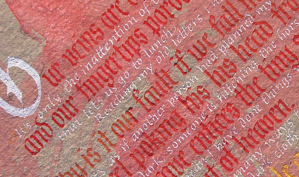


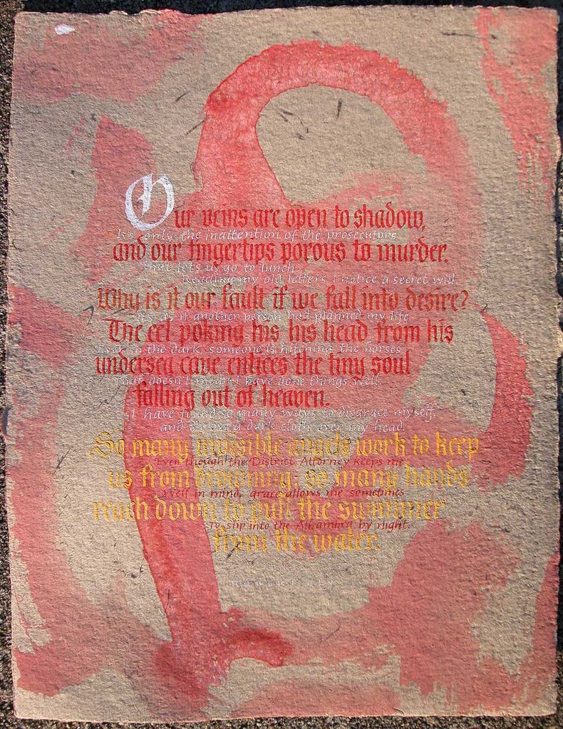
Hindsight being what it is, I should have done several things differently. But this piece is an experiment, as are all my current pieces. The paper is 8.5" x 11", the blackletter is 1/4" high. I was trying to emulate Friedrich Neugebauer's Fraktur, from his book The Mystic Art of Written Forms. The tiny italic lettering is the tiniest I can manage, about 3/16" high.
John tells me I should rename my blog. One of the names he has thrown at me, tongue in cheek, is 'The Germans Are Better Calligraphers.' (This I suppose because of my rants about E.J.) And it is true that I am enchanted by German calligraphers. Perhaps in part because I can't actually read some of the books I have by them! I have a copy of a little book by Rodolf Larisch, Unterricht In Ornamentaler Schrift, published in 1934, that I paw through occasionally, wondering if I can hold captive my Swiss friend who speaks five languages fluently and could translate the book for me if I locked her up for a few days...unfortunately she already has a full and interesting life. I really should have kept up studying German. One of life's regrets. At least I can pick out a word here and there.
I also enjoy looking at Karlgeorg Hoefer's Kalligraphie, Gestaltete Handschrift. And the recently published book about Adolf Berndt's work. The Germans are just so cool! They do this great bold work and they don't apologize for it. I feel more blackletter/textura/fraktur in my future...
Friday, November 17, 2006
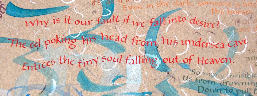 This is part of a poem by Robert Bly, entitled The Eel in the Cave. I am using the acryla gouache on some handmade paper I bought at an art sale last spring. When I put down a wash using the acryla gouache it renders the soft handmade paper surface more suitable for writing on with a hard metal nib. Otherwise the metal nib just digs out the soft fibers--especially if it is a very small nib.
Tuesday, November 14, 2006
Ignore the Future!
I asked John Stevens once when he came to teach a workshop, "but how do you let yourself do these amazing pieces, when there is so much to worry about?" (I think we were talking about how freelance work is feast or famine, and during the slow times he gets busy exploring new creative options.) For he had shown us much work that was pure fun.
I am still puzzled. How do people let go of fear of the future? They say that it is this which distinguishes us from animals: our ability to perceive that a future exists, and then to either worry about it or plan for it or ignore it. I am still, all these years (and it's been at least 12) later stunned at John Stevens' offhand reply to my question, something like, "oh, you just don't think about it."
Wow. Compartmentalize worry. Block it off, chase it away, give yourself permission to have a little fun with pen and paper. Try not to think of the billion and one other, more legitimate things that should be done.
I was thinking I ought to do a piece to celebrate Cat Stevens' (his website is pretty cool) return to music! Or at least pull out the greatest hits cd and listen to it. And it just occured to me that I have referenced two men with the last name of Stevens in one post, quite by accident! spooky.
I am still puzzled. How do people let go of fear of the future? They say that it is this which distinguishes us from animals: our ability to perceive that a future exists, and then to either worry about it or plan for it or ignore it. I am still, all these years (and it's been at least 12) later stunned at John Stevens' offhand reply to my question, something like, "oh, you just don't think about it."
Wow. Compartmentalize worry. Block it off, chase it away, give yourself permission to have a little fun with pen and paper. Try not to think of the billion and one other, more legitimate things that should be done.
I was thinking I ought to do a piece to celebrate Cat Stevens' (his website is pretty cool) return to music! Or at least pull out the greatest hits cd and listen to it. And it just occured to me that I have referenced two men with the last name of Stevens in one post, quite by accident! spooky.
Saturday, November 11, 2006
the Edward Johnston Foundation website
"The Edward Johnston Foundation is dedicated to the promotion of public awareness of calligraphy, not only as an art form in its own right but also as the seed and reference point for many other lettering disciplines including modern typeface design. Based in Ditchling, Sussex the birthplace of the modern revival of calligraphy, the Foundation is working towards the establishment of a permanent centre for learning, research and education in the lettering arts."
(from the website)
And Hermann Zapf is the Honorary President! My hero. sigh.
"...freedom comes through discipline, structure and understanding."
They promote handwriting and have seminars and a library. Unfortunatly they do not actually have a premises yet, so I'm not sure how one accesses the books in the library.
However, the line-up for the Seventh Annual Seminar 'Pen to Printer' in 2007 looks very exciting. May 18-20; be sure to write it on your calendar in ink!
(from the website)
And Hermann Zapf is the Honorary President! My hero. sigh.
"...freedom comes through discipline, structure and understanding."
They promote handwriting and have seminars and a library. Unfortunatly they do not actually have a premises yet, so I'm not sure how one accesses the books in the library.
However, the line-up for the Seventh Annual Seminar 'Pen to Printer' in 2007 looks very exciting. May 18-20; be sure to write it on your calendar in ink!
more on EJ
I like to think EJ possessed a modicom of humility. I like to think he would not have objected to calligraphy and its teaching methods evolving beyond him. It reminds me of the founding fathers of my country: they thought the constitution would last only a hundred years or so and that it would then be scrapped and rewritten to suit the evolving country. Yet here we are, still clinging to that constitution, unwilling to evolve.
I have been reading EJ's book Formal Penmanship, complied by Heather Child after his death. In it he explains that formal writing went from Rome to Ireland, from whence it was passed along to England, and finally, from England went to the rest of Europe. Hmmm. I wonder how the Romans prevented it from prematurely spreading to their neighboring lands?
There are those who complain that some of us are not giving EJ the respect he deserves. Could that be me? Am I being disrespectful to even broach these matters?
I have been reading EJ's book Formal Penmanship, complied by Heather Child after his death. In it he explains that formal writing went from Rome to Ireland, from whence it was passed along to England, and finally, from England went to the rest of Europe. Hmmm. I wonder how the Romans prevented it from prematurely spreading to their neighboring lands?
There are those who complain that some of us are not giving EJ the respect he deserves. Could that be me? Am I being disrespectful to even broach these matters?
Wednesday, November 08, 2006
Frog Prince
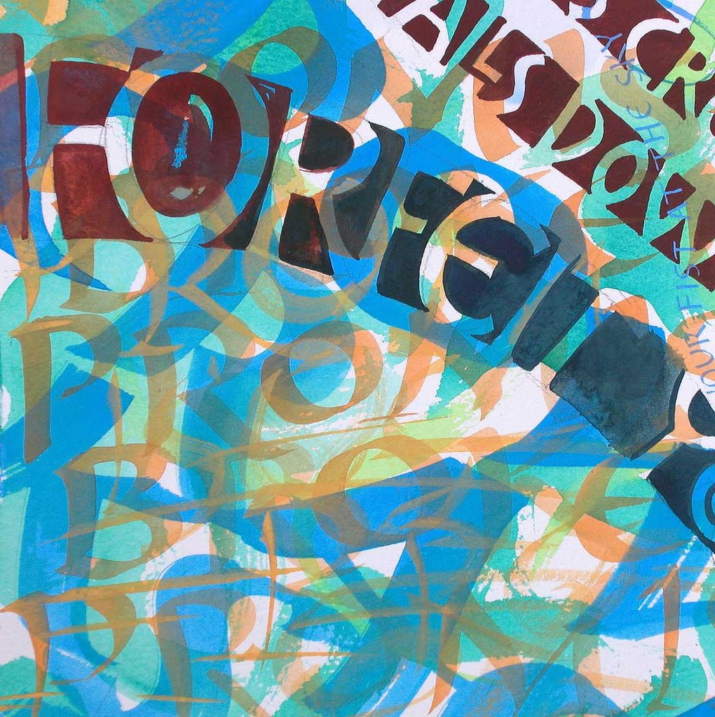
 This is the whole piece--a full size sheet of Arches cold press watercolor paper. I have never indulged myself in the luxury of using a full piece before, all at once! But I have a lot of paper I've been hoarding...and for what? Might as well use it. I am going to leave it alone and do something else. I could go on forever, adding more and more text, painting over things I already did, and it is tempting to see how long I can stick with one thing. But it's worn out its welcome and it's time to move along.
Still using the Holbein acryla gouache. Amazing stuff! It mixes with anything! I mixed it with some casein I had in my palette and it didn't bat an eye. I really don't see the point in using anything else. Maybe eventually I'll get tired of it. Maybe not.
hideous
Whoa! Look what monster came out of the bag! It is so refreshing to see something I did that is not trying to be beautiful. It is like something that has crept up from underground. Something hideous. Something I did on election day. Somehow appropriate.
Honestly though--what a relief to just do something without needing it to be appealing. Perhaps art can only be art when it is something that bubbles up, given opportunity to exist, uncontrolled (although everything is somewhat controlled, isn't it?). Not something forcibly create d to fill a certain bill.
Ideally, with calligraphy-as-artwork, the creator does a portion, stands back and assesses what is there, and then decides intuitively what to do next, does it, and reapeats the standing-back-and-assessing procedure again. The important thing is to know when to stop. (I learned this from Steve Skaggs.)
Honestly though--what a relief to just do something without needing it to be appealing. Perhaps art can only be art when it is something that bubbles up, given opportunity to exist, uncontrolled (although everything is somewhat controlled, isn't it?). Not something forcibly create
 d to fill a certain bill.
 Ideally, with calligraphy-as-artwork, the creator does a portion, stands back and assesses what is there, and then decides intuitively what to do next, does it, and reapeats the standing-back-and-assessing procedure again. The important thing is to know when to stop. (I learned this from Steve Skaggs.)
Subscribe to:
Posts (Atom)